

MANGO website show a very strong feeling on modern and stylish fashion for women. The navigation bar is clear and they have a very good typo treatment on magazine, information, navigation bar etc. On the first page they put video on it, a very nice way to give extra feeling and information for the customer. On the shopping page, they enlarge every single item and put roll-over effect on how it's look like on a model. Very fantastic.
______________________________________________________________________

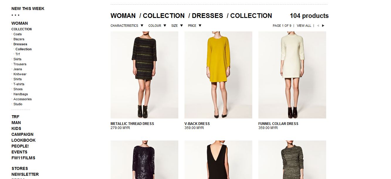
Very modern and stylish layout to bring out the feeling of the brand. But of the shopping list page, i feel the page is boring and look very empty, if they add on some graphic or roll-over effect for the images it will be nicer. Overall the layout and navigation of the website is good.
______________________________________________________________________


Classic and a little-bit of modern style. The home page look a bit messy with too many information, but the focus point is big enough to catch your eye! Overall the page of shopping list etc is very simple and neat, the special part is the history part, they provide a very good way to show the before and after.
______________________________________________________________________


Elle website is run with system but too messy and the navigation is bad. It is very confusing compare to others website, too much information and the type system is bad, overall is bad.
______________________________________________________________________
No comments:
Post a Comment